Home Dashboard
January 2026
The challenge
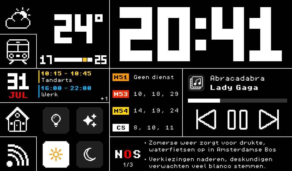
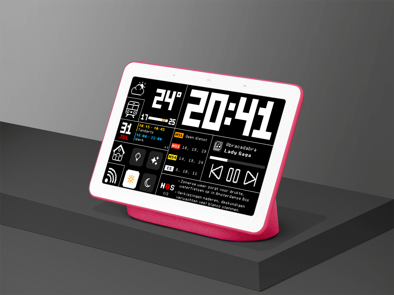
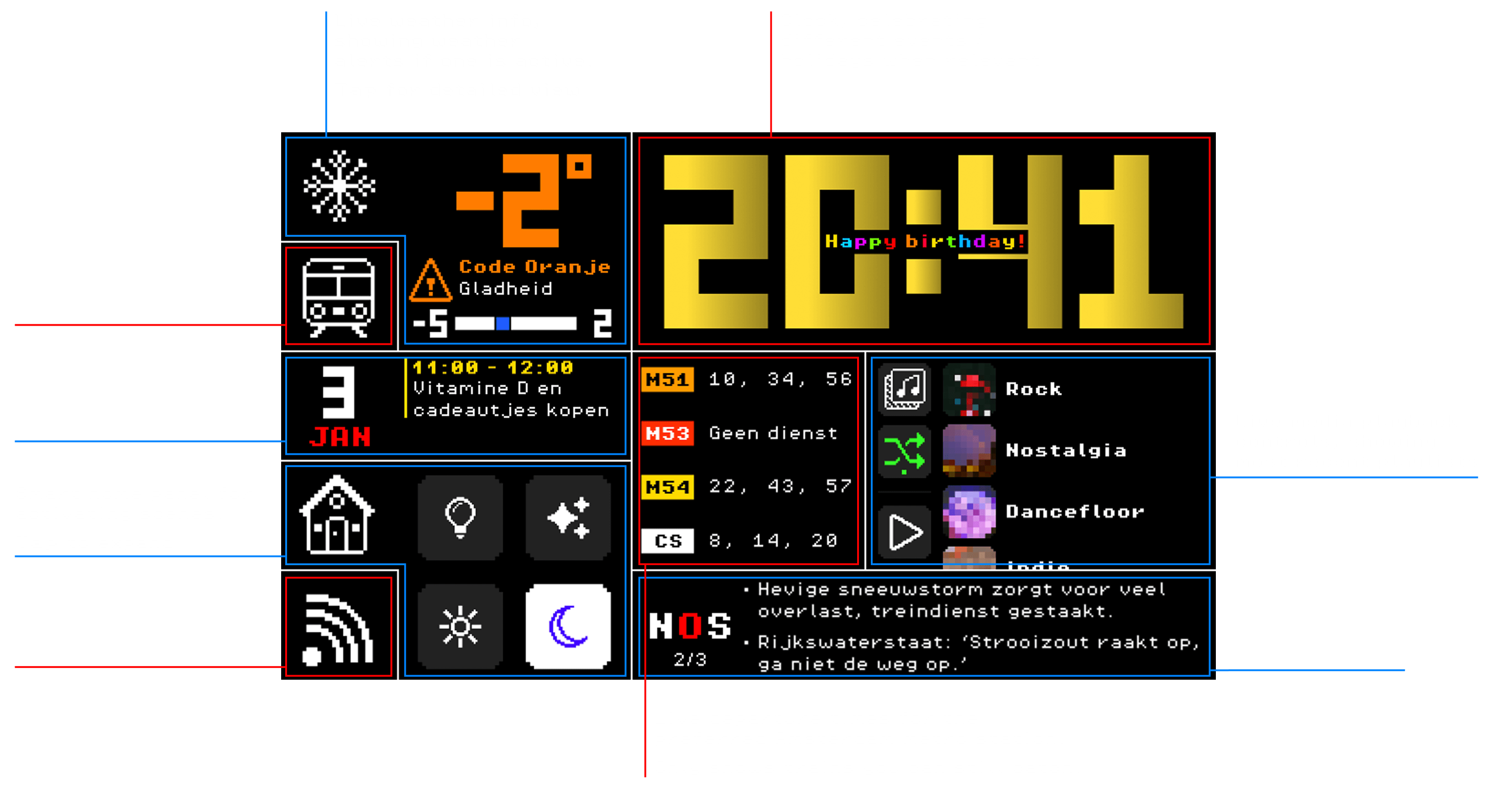
In my home, I have a smart speaker with a touchscreen that does little more than display the time and temperature. Seeing that as wasted potential, I designed a custom home dashboard interface that transforms the display into something genuinely useful, tailored to a specific user.
Arcade Style
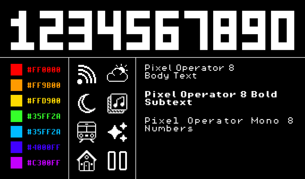
I designed the dashboard with an arcade inspired visual language, combining pixel art icons from independent artists, a custom 3x5 pixel font for numbers and symbols, and the Pixel Operator 8 typeface for body text.
Saturated colours, influenced by classic Teletext interfaces, reinforce a retro digital atmosphere. The bento grid layout enables a modular presentation of information, creating clear visual separation between individual content modules while maintaining overall cohesion.
Information dense
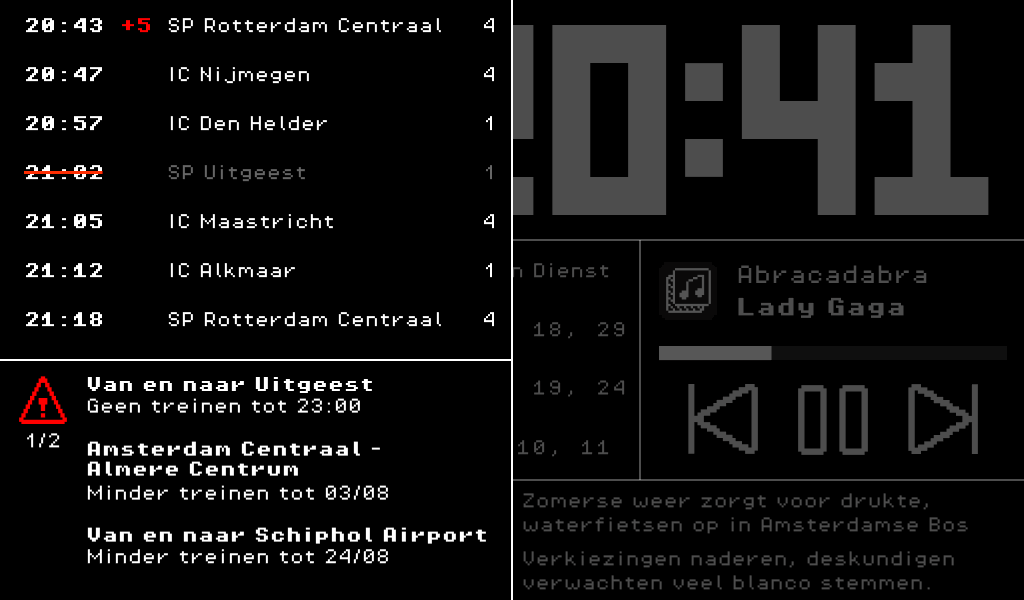
Because this interface has a permanent place in the home, I prioritised information density over immediate ease of use. This results in a slightly steeper learning curve, but allows the user to access significantly more information at a glance once familiar with the system.
I also designed the interface to be highly dynamic, responding to contextual events such as national holidays and weather alerts to keep the experience relevant and alive.
The result
I am very happy with how this personal project has developed so far, having explored the unique interactions and functionalities made possible by allowing for a steeper learning curve. I hope to further develop this concept into a fully functional dashboard in the future.
Sources
For the icons, I used these icon packs: